
Images make up a large proportion of your page content on most websites. So, it’s important you optimise these images for SEO. When you think of image SEO, traditionally SEOs have standard image optimisation techniques such as optimising image alt text, file names with keywords, reducing file size and using image captions. There’s a lot more than just these factors you’ll learn in this guide to help SEO images improve Google visibility. If you’re exploring the rise of AI-generated images and their SEO impact, we’ve covered that in detail.
How to SEO Optimise Images?
- Image Alt Text for SEO
- Image Compression for SEO
- Providing Width & Height Elements for Images
- Lazy Loading – Deferring Off-screen Images
- Properly Size Images
- Make your images Responsive – Use of the Srcset Attribute
- Image Metadata Removal
- Product Image Optimisation – Use of Image Structured Data
- Image Sitemaps
- Image Optimisation Tools
- Google Images SEO Best Practices Video
Image Alt Text for SEO
Image Alt text, which is nothing but the text used to describe what an image is about, was primarily introduced for accessibility reasons for users with visual impairments. This text is used by Screen Readers to read out the alt text as users come across images. Google uses alt text to understand what an image is about. Also, on slow connections, when images sometimes fail to load, the alt text gets displayed and hence is good from a usability standpoint. The text also acts as an anchor for internal links.
Google uses alt text as one of the factors for image ranking within Search results. In terms of SEO best practices for the image alt text, they need to be relevant & descriptive for the best performance within image SERPs.
Image SEO Alt Text Best Practices
- The text should be concise and descriptive to accurately describe what an image is about.
- Avoid keyword stuffing. Don’t go too descriptive on the text. Stick to fewer than 100 characters.
- Try to include your target keyword appropriately. For an eCommerce site as an example, you could include the name of the product, SKU, ISBN, model number, etc, to make the alt text descriptive.
There are several ways to view the alt text used in an image. You can use site crawlers like ScreamingFrog or Sitebulb to view these in bulk for several pages. You could also view them using browser extensions such as SEO META in 1 CLICK for all the images on the page you are on. My preferred method of viewing alt text is in the code by right-clicking on the image and clicking on Inspect to view the image element.
Image Compression for SEO
Pay attention to image file sizes as they can affect the overall performance of your webpage. The heavier the images are than required, the longer it’s going to take for the page to load. Large images can cause performance problems if you’ve got lots of them in place on your site. You can use a site crawler like Screaming Frog or Sitebulb to help identify images that are too big. on your website. There are image optimisation techniques you can apply to compress these large images with minimal to no loss of quality.
Compression techniques need to be applied to large images to reduce their overall file size. As a general best practice for the e-commerce sites that I have worked on, I advise the client that the image file size must be at most 200 to 300 KB for editorial/landing pages and less than 100 KB for e-commerce pages. This is, in my experience, easily achievable for e-commerce sites without reducing overall perceived quality.
There are two different types of compression;
- Lossless Compression: With this type of compression, when the file is compressed, the picture quality remains the same. It simply compresses the pixel data without making the image worse. Also, that file can then be decompressed to retain or revert it to its original quality. PNG is an image format that supports lossless compression.
- Lossy Compression: This compression type permanently removes some pixel data. With lossy compression, you can significantly reduce file sizes compared to lossless compression. JPEG is a lossy image format that offers a better compression rate than PNG.
Image file formats can make a big difference to the overall file size and image optimisation. Not using the right image file formats can affect your image optimisation efforts. Let’s take a look at the most commonly used image file formats for the web;
- JPEG: One of the most widely used and best file formats for the web that offers really good compression. It’s a lossy file format, and you can compress images to a certain level so there’s minimal loss in visual quality. JPEG is normally used for large images or illustrations.
- PNG: This is a lossless file format, and it has higher quality than JPEG, but it comes with a larger file size.
- WebP: One of Google’s highly recommended file formats to use, as it was created by Google itself. This format uses a more aggressive algorithm for compressing images to create images that are smaller in file size than JPEGs with no visual loss in quality. The support for this format is still not widely supported across browsers, especially Safari and Internet Explorer, so alternatives will need to be offered for these browser users.
- SVG: This is a lossless file format mainly used for logos, icons and basic line drawings.
- GIF: This format is used when you need animation.
There are a number of other image file formats, such as TIFF, RAW, etc, that are not commonly used for the web, so safely avoid them. With so many image formats available, choosing the optimum file type is important. Use https://caniuse.com/ to check if your chosen image file type is compatible with the most popular browsers.
Provide Width & Height Elements for Images
This used to be an overlooked area pre-introduction of Core Web Vitals. Front-end developers are more aware these days and explicitly provide width and height attributes (in pixels) for images to ensure that the browser can fully understand the structure of a page and reserve the correct amount of space for that image while it’s loading. Doing so can prevent your page elements from shifting around the page while loading, i.e. prevents cumulative layout shift (CLS).
Lazy Loading – Deferring Off-screen Images
This is quite a common recommendation that is flagged within PageSpeed Insights. Lazy Loading reduces initial load time by only loading the images above the fold. As the user scrolls on the page, that’s when images below the fold load as they appear. This helps conserve server bandwidth and client resources as we are delaying the loading of images that are not visible within the viewport until they are actually needed. The images are only loaded when a user scrolls down a page, translating to a faster and more optimal user experience.
For CMSs such as WordPress, Drupal, Joomla, Magento, etc, there are a large number of different plugins and modules that can help with deferring images.
Without lazy loading, all images would have otherwise loaded for a page, even those that appear below the fold, which may not even get seen by a user and can unnecessarily extend load times.
Properly Size Images
To ensure the best possible performance for images, make sure you only deliver scaled image assets, i.e., correctly size them for the browsers and the viewports that they’re going to be used on. Always resize them on the server instead of allowing your images to get resized on load via CSS and HTML.
Make your images Responsive – Use the srcset Attribute
Pages should always serve images that are no larger than what is displayed on a user’s screen. So, for example, an image made for ultra-wide screens should not be served for mobile users, as it will be a large image for a smaller device, impacting load time.
You can serve a different image for mobile users instead of serving the same huge image that was designed for large screens. This is achieved with the help of responsive images, wherein multiple versions of an image are generated, with each image containing viewport dimensions specific to individual browsers or viewports. This is achieved through the implementation of the srcset attribute. The browser picks the preferred size of the image to be served based on the device type.
In the Sports Direct example below, we can see that two individual JPEGs are quoted. First up, we’ve got a 1920-width pixel with JPG, and in the second line, we’ve got a 768-width pixel JPG. When the viewport is over 768 pixels in width, the 1920 pixels (larger image) image is served as the min-width is specified. This helps ensure that the best possible image is served for the appropriate device type.
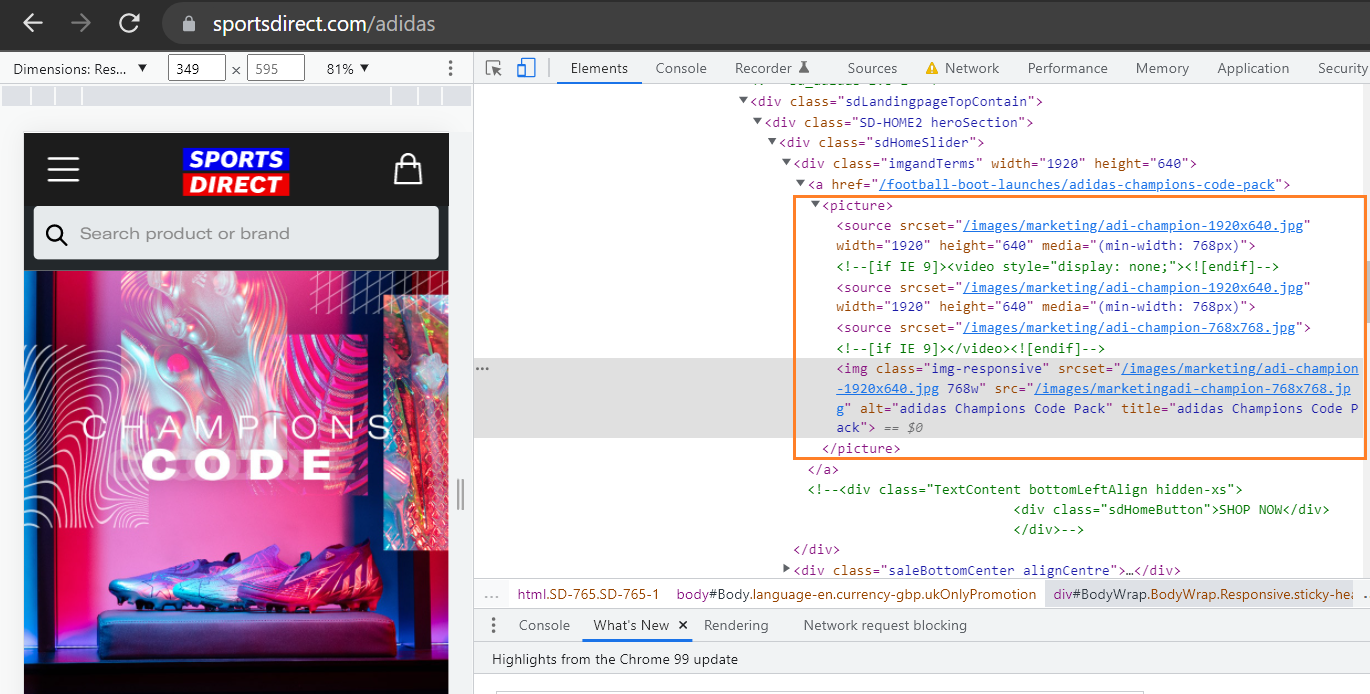
Image Metadata Removal
When you take a photo using a camera, a bunch of extra information called EXIF gets stored in the image file, which adds to the overall image size in certain file formats. Remove this unnecessary image metadata, such as the geo-information or camera device information, such as device make and model, the lens used and focal length, exposure time, aperture, etc. There are several apps or plugins available to remove EXIF data.
Product Image Optimisation – Use of Image Structured Data
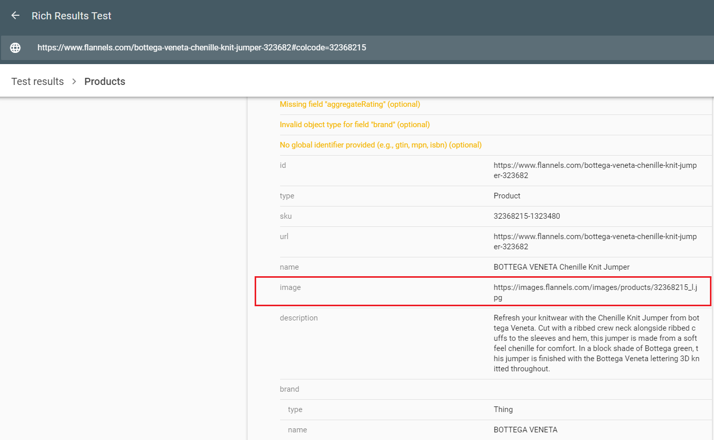
Image Sitemaps
Many sites, especially e-commerce sites, implement image sitemaps to improve their product listings in search. Each <URL>tag can contain up to <image:image> 1,000 tags.
Image Optimisation Tools
There are a number of tools available to run checks on your web pages. With these tools, almost all the time, you are presented with several opportunities to optimise images. Here are a few popular ones;
- PageSpeed Insights is a free tool offered by Google to run page speed tests on any URL. You are presented with a number of detailed recommendations to improve the performance of your page. Some image optimisation-related recommendations include the use of next-gen formats, missing width and height attributes, properly sizing images, efficiently encoding images, etc.
- GTmetrix and WebPageTest are other popular page speed testing tools that can be used to evaluate image-specific metrics impacting overall page performance, among others.
- There are a number of free online image optimisers and great plugins that can help you with optimising & compressing images and lazy loading.
- For WordPress: Smush, Imagify.
- For Shopify: Crush.pics
- Free online image optimisers: TinyPNG, Kraken.io.
How to Implement Hotlinking Image Protection Without Affecting Google Image Search
Hotlink protection is implemented to prevent other websites from using your images without your permission via a hyperlink. When an image is hotlinked, it is being loaded from your server, meaning that your server is being used to serve the image to the website that is hotlinking it, thereby resulting in your hosting bandwidth theft and increased server load. Normally, you would notice your images being hotlinked by low-quality site scrapers.
There are a few different ways to protect images from being hotlinked, without impacting Google’s Image Bot’s ability to crawl your website. One method is to add the Googlebot user agent to the list of allowed referrers in your .htaccess file. Here is an example of code that can be added to an .htaccess file to prevent hotlinking, while allowing Googlebot to crawl the site:
RewriteEngine on

RewriteCond %{HTTP_REFERER} !^$

RewriteCond %{HTTP_USER_AGENT} !Googlebot

RewriteCond %{HTTP_REFERER} !^https://([^.]+\.)?google\.

RewriteCond %{HTTP_REFERER} !^https://([^.]+\.)?bing\.

RewriteCond %{HTTP_REFERER} !^https://([^.]+\.)?yahoo\.

RewriteCond %{HTTP_REFERER} !^http(s)?://(www\.)?yourdomain.com [NC]
RewriteRule \.(jpeg|JPEG|jpg|JPG|gif|GIF|png|PNG)$ - [NC,F,L]
In this example, the code blocks all requests for image files (jpg, jpeg, png, gif) from any website that is not yourdomain.com and the user agent is not Googlebot, so Googlebot can access the images.